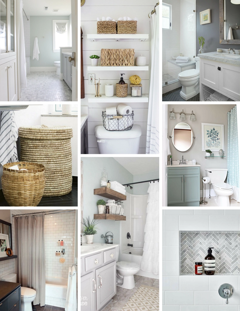
light green | shelves | dark walls | circle mirror | tile inlay | ruffle curtain | subway tile | basket
And now the realistic one, a little different feel than the dream bathroom I talked about yesterday, eh? It’s totally different and I’m 100% ok with that because these designs and floor plans make so much more sense for our current space. Overall, these feel quite a bit less trendy and much more classic but there’s nothing wrong with that in my book. As usual, I’m leaning towards the light blue tones, white, and some natural fibers and wood. I believe I’ve narrowed the shower tile to a nice classic subway in a larger size with a tan or slate colored floor tile.
Regardless of the design, we’ll be decreasing the amount of storage from one hanging and two medicine cabinets (yes, really) to none. I’m hoping to make the most of our under the counter space and some open shelving above the toilet like the ones pictured. I love how these have more in feel than some of the options from yesterday. We’ll see how it all turns out – so keep an eye out for some before pictures and a vision board coming soon.

